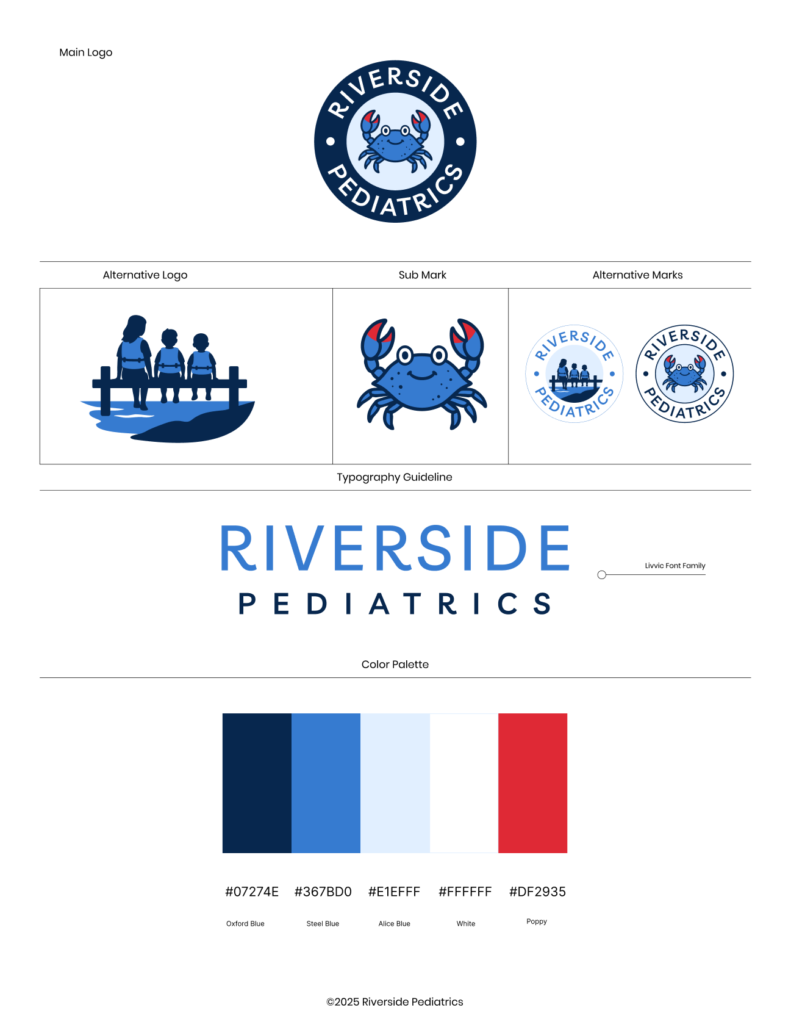
This project was a special one from the start. A close friend reached out when his wife was getting ready to open her own pediatric practice, Riverside Pediatrics. Working with her was a fantastic collaborative experience—she came to the table with core concepts and visual elements that already had personal meaning, giving us a great foundation to build from.
My goal was to refine and elevate those initial concepts into a cohesive, professional brand identity. I cleaned up vector illustrations, established balanced typography using the Livvic font family, and defined a vibrant, coastal-inspired color palette featuring Oxford Blue, Steel Blue, Alice Blue, and Poppy Red. From the main circular badge logo, sub-marks, and alternative family dock graphic, the end result is a warm, trustworthy, and child-friendly visual system ready for print, web, and clinical signage.