As a business bank, the brief was really about one word: trust. Everything needed to read as solid, established, and dependable before it said anything else — this is the kind of institution people hand their business finances to, and the mark needed to earn that confidence at a glance.
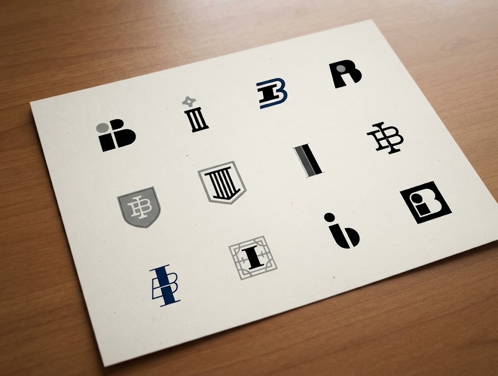
I started the way I always do — on paper, before anything touches a screen. Pulling from the client’s name, I worked through a wide range of directions: an initialed monogram, a shield, a classical column motif that nodded to the “pillars” of good banking, a few marks that tried pairing the I and B directly together. Sketching loose and fast at this stage keeps me from getting precious about any one idea too early, and it gave us a lot to react to together before narrowing in. Here’s a pic of those sketches polished up.
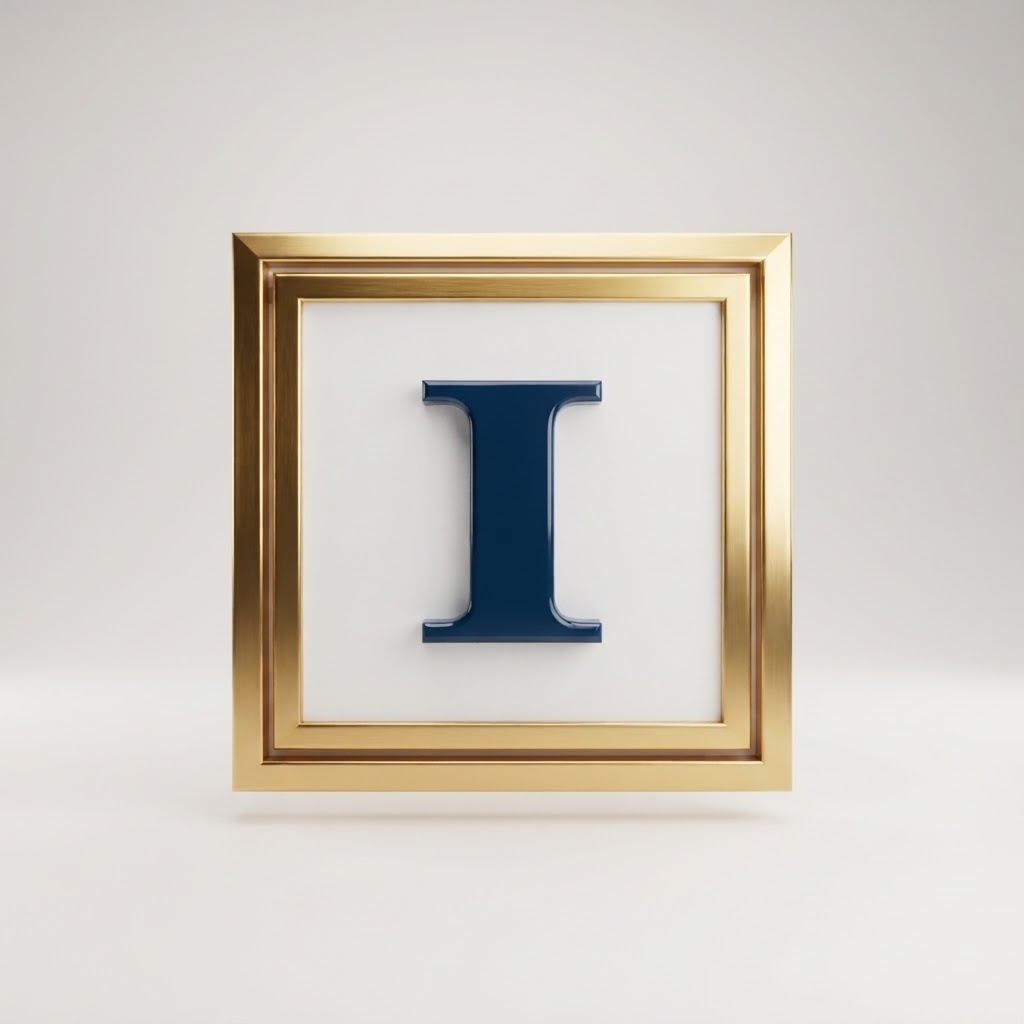
We landed on something simpler than any of those: a bold, classical “I,” set inside a framed square. The serif letterform does a lot of the talking on its own — it reads as established and a little old-world, which is exactly the kind of permanence a business bank wants to project.
Framing it like a piece of hung artwork or a plaque gives the mark weight and a sense of being fixed in place, like a cornerstone.
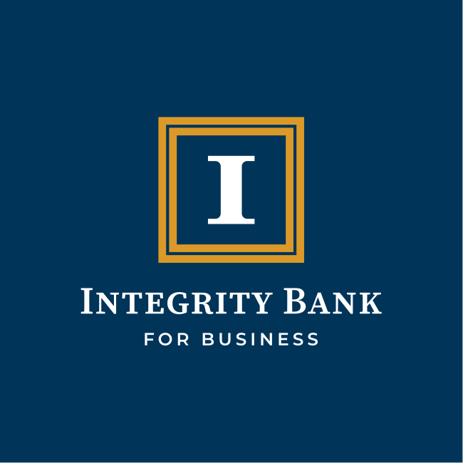
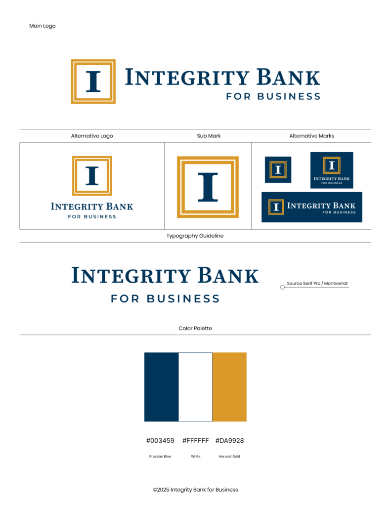
From there it was color and type. Prussian Blue and Harvest Gold became the core palette — navy for stability and trust, gold as the accent that keeps the whole thing feeling a little more premium than your average bank branding. Source Serif Pro carries the wordmark and headlines, paired with Montserrat for everything that needs to read clean and modern underneath it.
Everything then went into a full style guide — primary logo, alternative lockup, standalone submark, and reversed versions for use on navy — so the Integrity Bank for Business team has a single source of truth for how the brand shows up anywhere it’s used, from signage to statements.
This was a fun one to work on from start to finish — a local client, a clear problem to solve, and a mark I’m genuinely proud to see representing a Virginia Beach business.
Always glad when a project lets me build something with a little more permanence to it.